
Below the Mountain, Antique & Vintage Store Visual Identity
Below the Mountain is an Atlanta-based purveyor of antiques and vintage goods. The assortment is eclectic and abundant, ranging from 18th-century furniture to 1970s fashion. Most sales come through social media, though the business also operates several retail booths at antique stores and markets across the city.
Working with the owner, John, I built a blueprint for the brand's creative and visual direction. Using that blueprint, I developed a visual system along with printed and digital assets. The system was comprehensive enough to cover the business as it stood, and flexible enough to adapt as it grew.
Year
2022
Role
Brand Designer
Scope
Creative Direction
Logo System
Color
Typography
Print Design
Digital Design
The Brand
Visual foundations
The name comes from The Hobbit, and honoring that literary root was the starting point. Like the story, the brand rests on a simple premise: treasure turns up around every corner and below every mountain. The identity needed to feel drawn from the past but still modern and fresh, and above all as unusual as the merchandise itself.
Logo System
The mark takes its cues from English merchants' marks of the 13th through 18th centuries. It is built on a simple geometric structure, with layered symbolism doing the storytelling. A modern sans serif in the wordmark keeps the whole thing from reading as a relic.

Typography
Old newspapers and catalogs offered no shortage of influence. They read like playgrounds of expressive type, all of it bent toward sales messages and punchy headlines. The foundation mixes serif, sans serif, and slab serif faces, chosen to set a baseline rather than close the door on future experimentation.

Color & Textrue
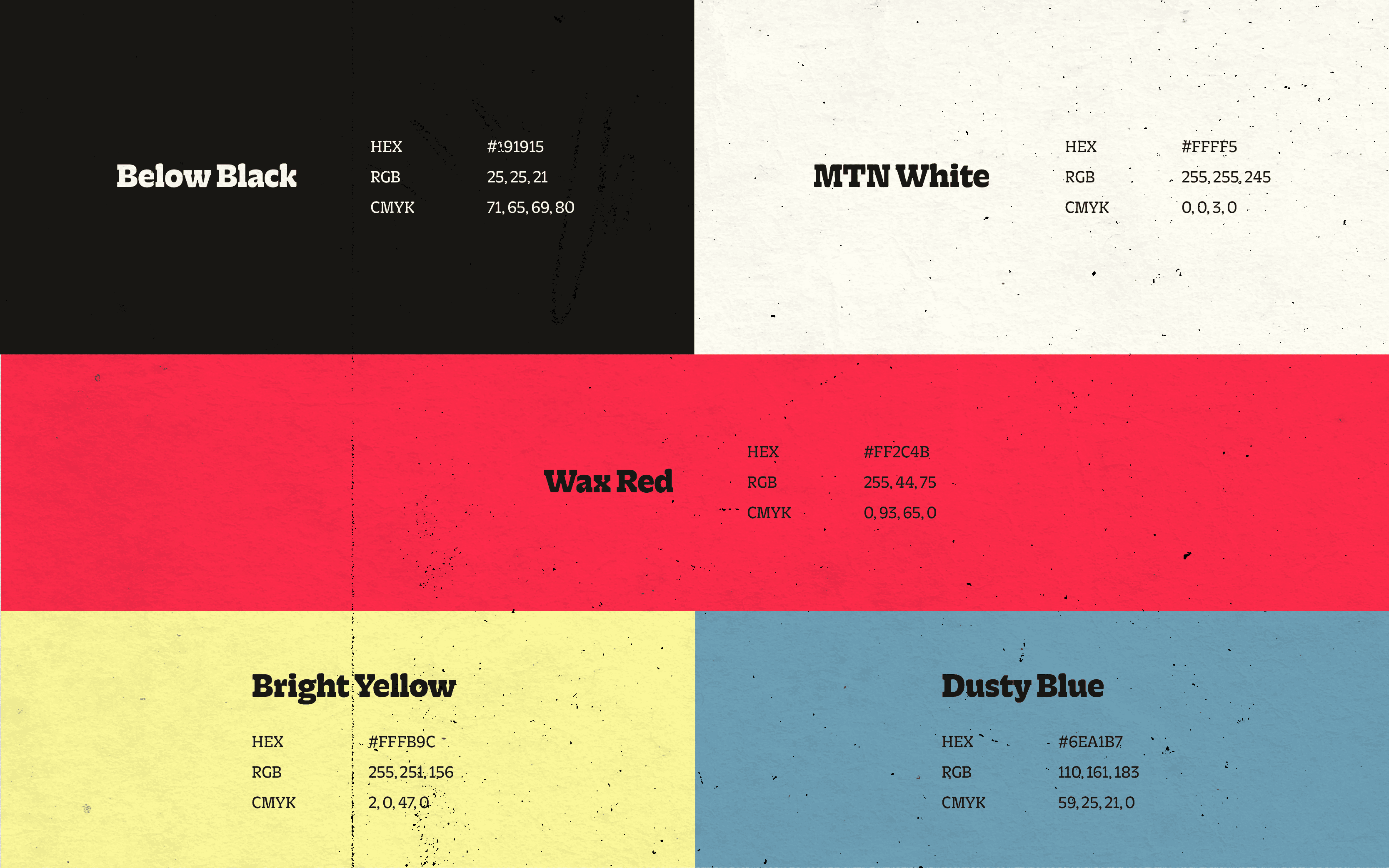
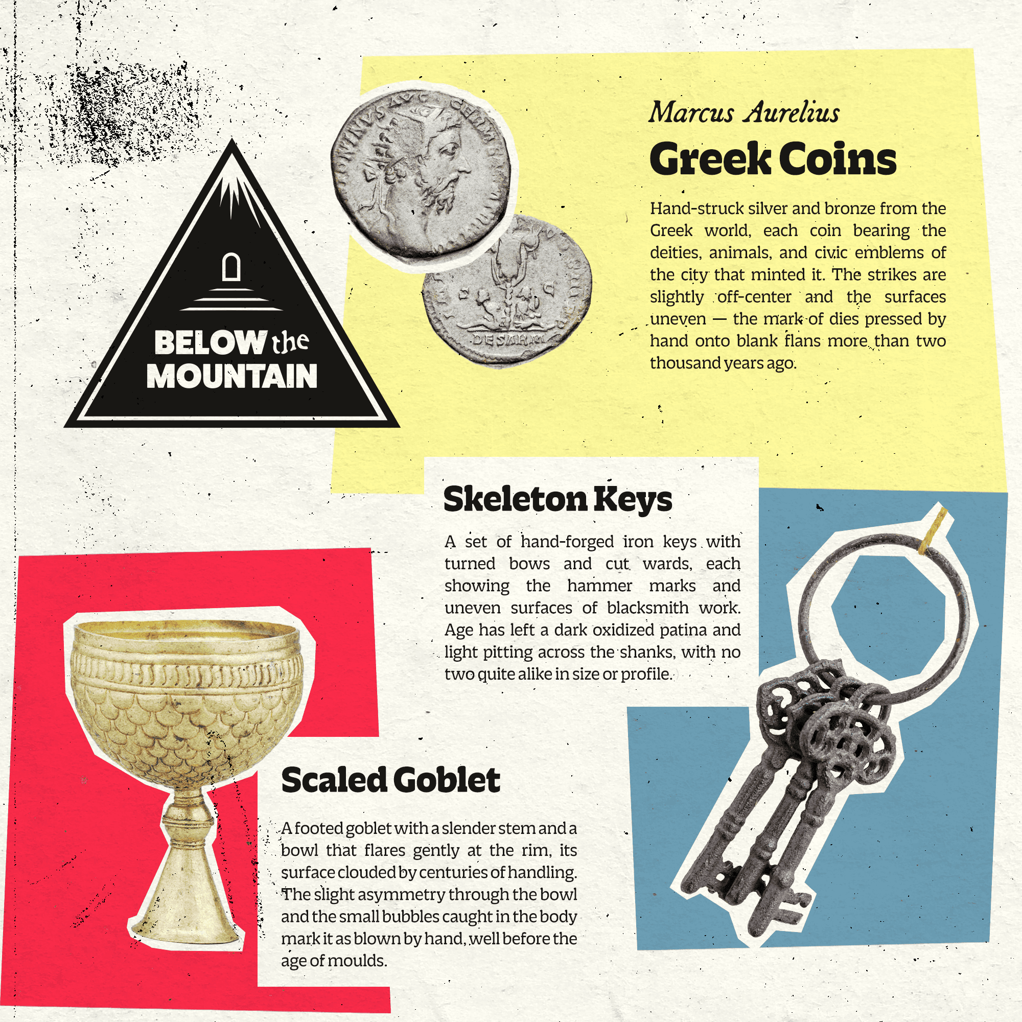
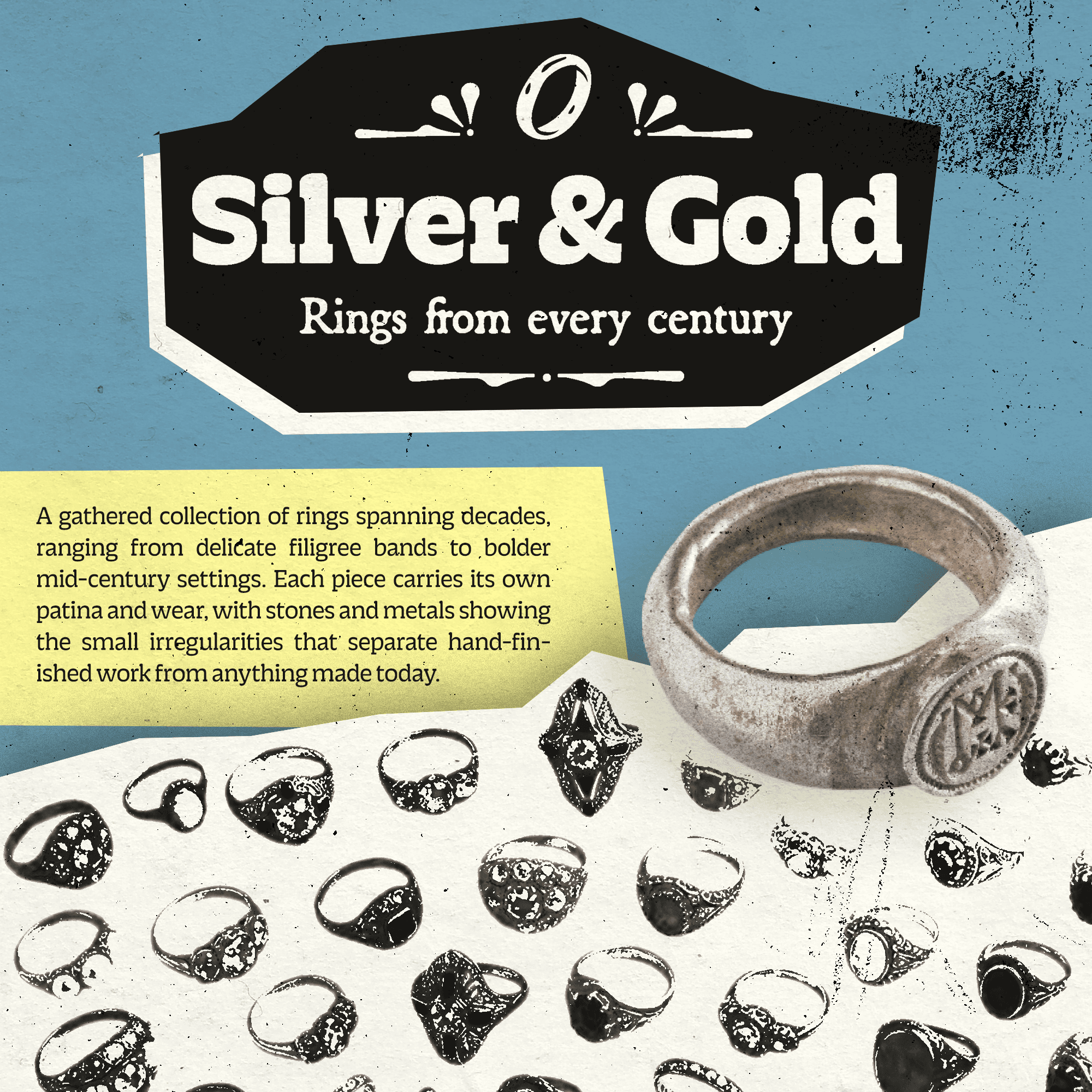
The palette draws on the simple primaries used in printing vintage magazines and catalogs. Paired with gritty, time-worn textures, the intent is to feel like searching through a time capsule.
Print Material
Tags, Bags, & More
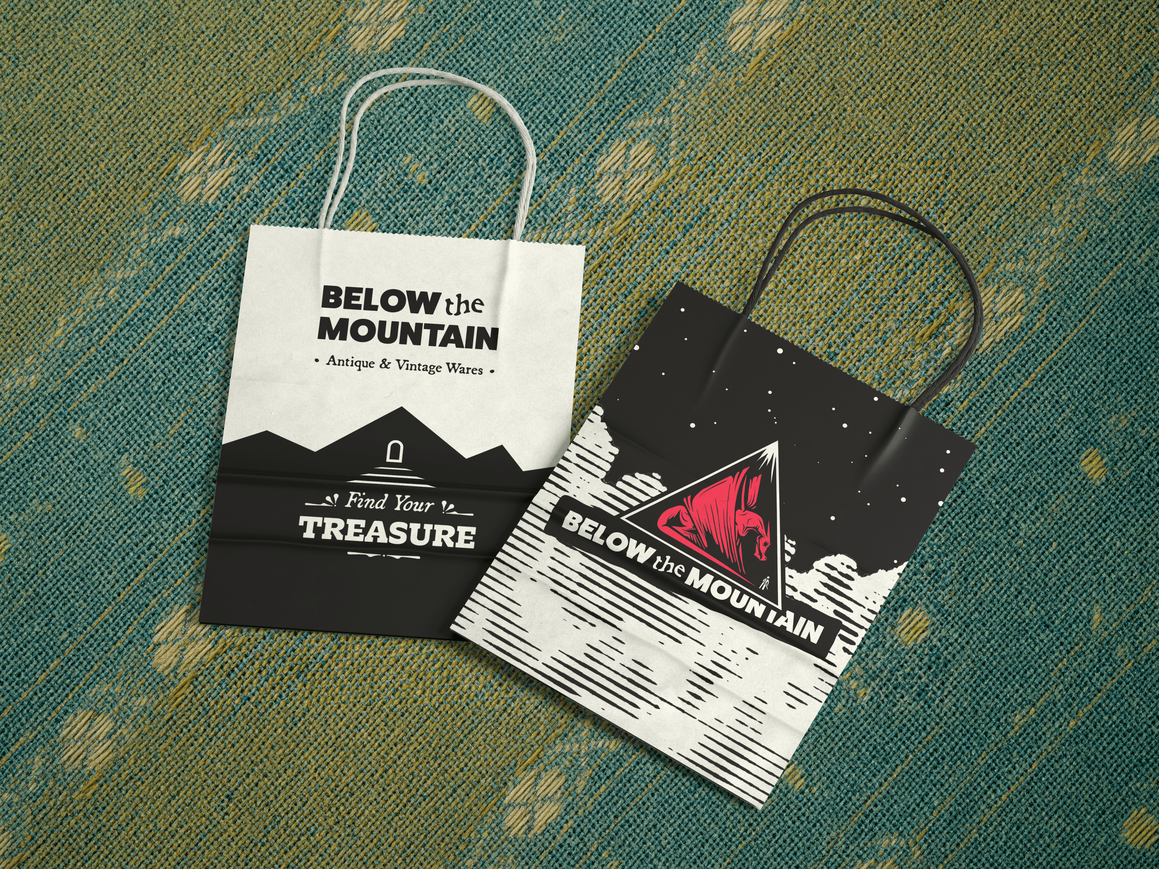
The print needs were straightforward: tags, bags, marketing collateral, and merchandise concepts. The stores and markets where Below the Mountain keeps booths hold dozens of other vendors, so anything carrying the brand had to stand out and register instantly from across a crowded floor.



Digital Design
Social Media Standards
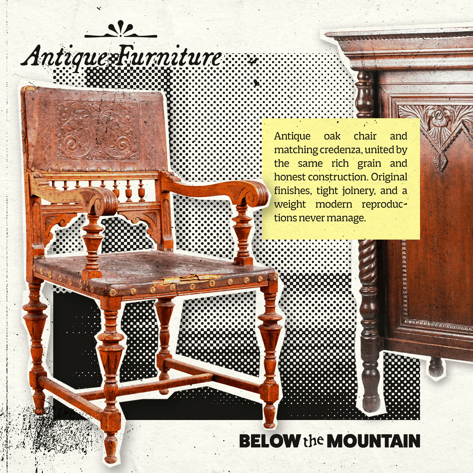
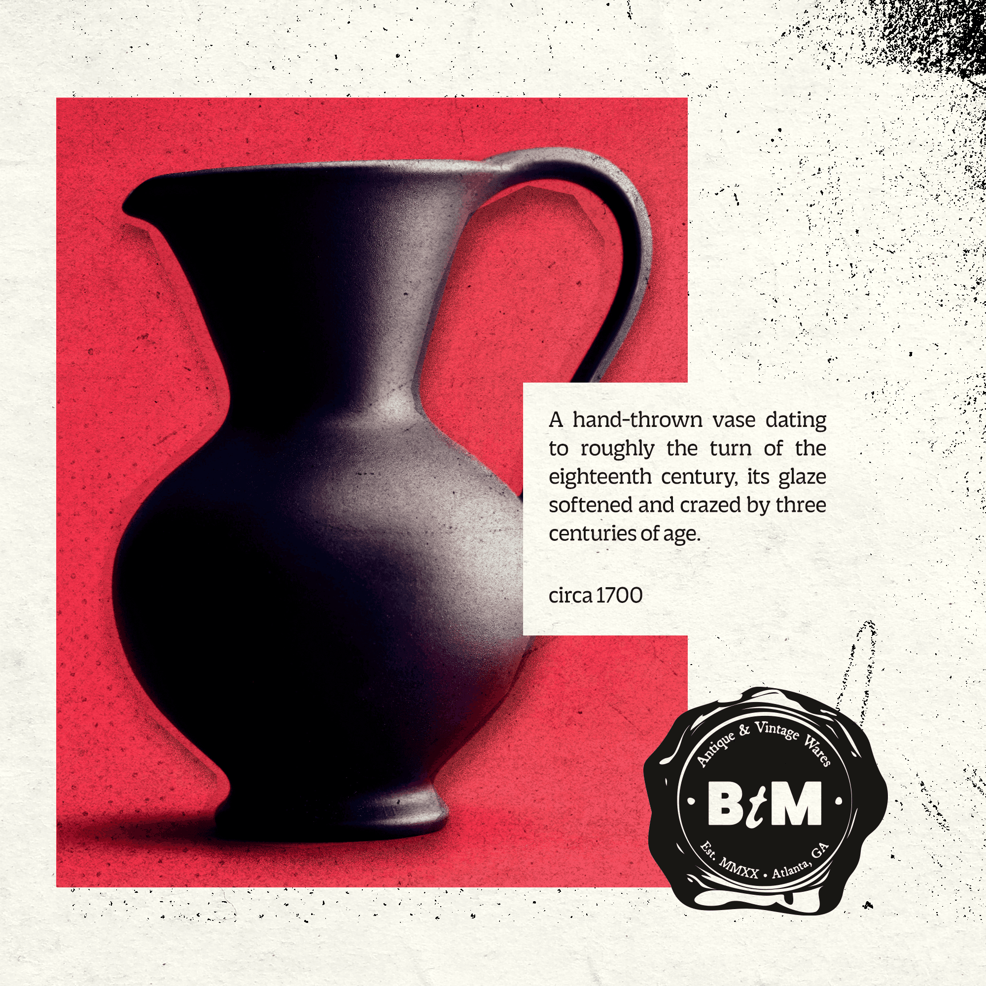
Because outreach and sales run largely through social media, each post and digital ad needed a consistent standard to follow. Scrolling the feed should produce the same nostalgia as flipping through an old catalog.



Beyond the Mountain
Since the launch, John has opened two additional booths at local antique stores to feature his wares. Social media remains his most effective channel for reaching customers, and the standards set by the brand guidelines have kept his posting and marketing consistent as that footprint has grown.
His long-term goal is a standalone brick-and-mortar location in the city. To help him picture it, I prepared early concepting for the storefront and exterior signage. The system was built to stretch that far, so the brand should arrive at the door intact, with room left to keep maturing as the business does.
The constraint that shaped the work: no two pieces of inventory are alike, and the assortment turns over constantly. The brand couldn't lean on the product to carry recognition, so the system had to be strong enough to hold a rotating cast of objects together and simple enough for one person to apply on his own, at a folding table, before a market opens.