
Building an Omnichannel Experience for Central Restaurant Products
Central Restaurant Products is a B2B retailer of foodservice equipment and kitchen supplies, selling through two channels: our e-commerce site and our call center. In early 2026, offline sales dropped sharply. The executive team formed a high-priority initiative and brought me in at the discovery stage, with the goal of using the website to generate leads for the call center.
Solution
Expand access and exposure to sales experts through redefined contact funnels and a rebuilt quote request feature.
Results
In the first month post-launch, we saw:
Web quotes up 130%
Over $1,000,000 in total quoted value
Inbound calls from the website up 20%
Offline sales up $154,000
Year
2026
Timeline
6 Weeks
Role
UX/UI Designer
Scope
Research
UX Audit
User Flow
Prototyping
QA Testing
Getting Started
Research & Discovery
Discovery centered on two activities: stakeholder interviews and an internal audit of our site's user experience. The interviews let me collect insights from the teams closest to our customers, while the audit revealed gaps and opportunities in our current implementation.
Stakeholder Interviews
Creating an omnichannel experience online required participation from several departments. Through a series of open discussions, I met with members of the sales, customer support, and marketing teams to gather firsthand information from customer interactions and to understand friction points in our own internal processes.
Below, I’ve compiled a few key insights and statements from each conversation.

UX Audit
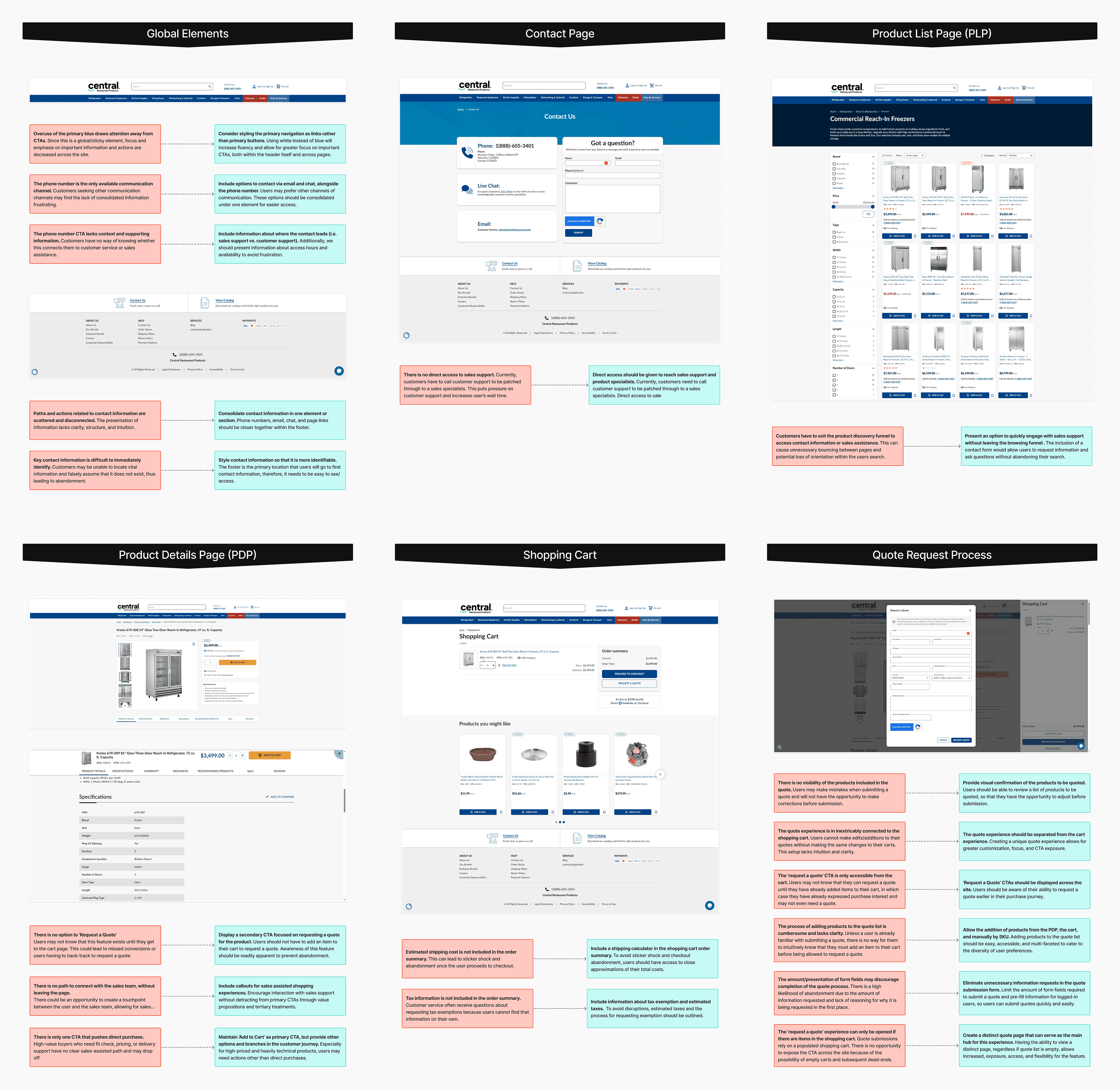
Building on those discussions, I ran a systematic audit of our website to understand our current approach to omnichannel service. I paid close attention to global elements where users might seek contact information at any point in their journey, and examined critical moments in the conversion funnel — product detail pages (PDPs), product listing pages (PLPs), and the cart — looking for points of friction, hesitation, or potential abandonment.
Defining the Direction
Exploring Problems & Solutions
Effective solutions require clearly defined problems. Therefore, I needed to synthesize my discovery findings into a set of actionable insights to direct our focus and drive ideation.
The Problems
Users are not requesting quotes from the website.
Access to the Request a Quote feature was extremely limited. Users had to build quotes by adding items to their shopping cart first. Without a standalone flow or dedicated quote page, users weren't made aware of the tool early enough in their purchase journey — and when they did find it, the process itself lacked usability and intuition.
Users can't reach the right expert at the right time.
Offline interaction with the sales team was in steep decline. The value of speaking with a sales expert or product specialist was never communicated to the customer, and access to the channels leading there was scarce. Compounding this, the funnels for customer support and for sales were not clearly labeled or separated, so customers and internal teams alike wasted time on redirects.
Users are abandoning their purchase journey.
Customers who weren't ready to convert on the web were leaving because they either couldn't find the right product or found the price too high. Both scenarios represent an opportunity for sales assistance, but neither had a path to help at those critical moments in the funnel.
Brainstorming and Ideation
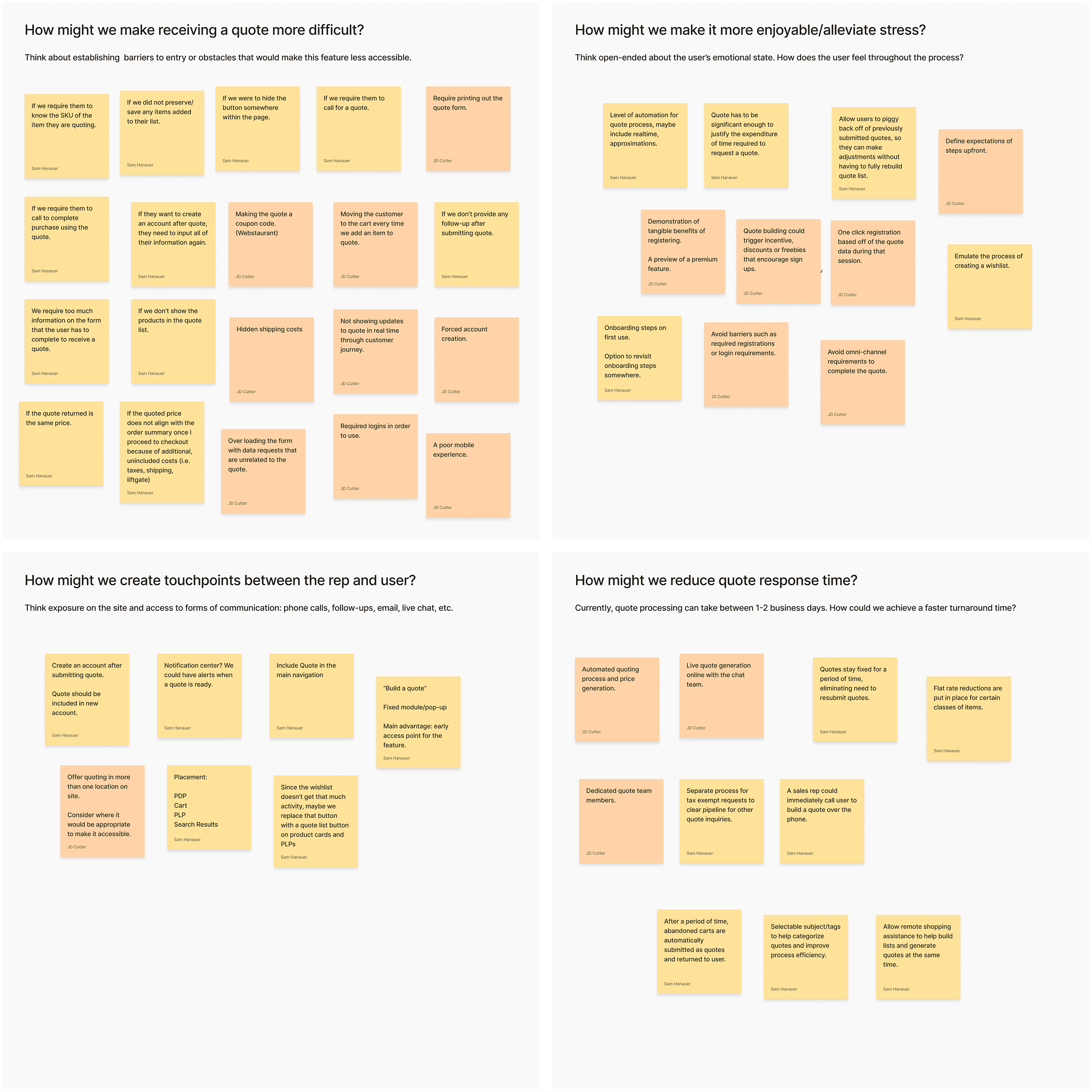
I ran a series of ideation exercises with my team focused on the problems we'd defined. The most productive was a "How might we…" session built around four questions, including one reversal: how might we make it more difficult to request a quote? By designing a deliberately worse process, we surfaced friction that already existed in our own — and the inverse of each bad idea pointed directly at a fix.
Building the Solution
From Design to Launch
From early concepts through QA and launch, I worked closely with teams across the organization. I pitched design direction and presented prototypes to stakeholders in four departments, then partnered with development through the build to keep the shipped product true to the approved designs.
Mockups and Prototypes
The project spanned many corners of our site and internal processes, which required an extensive set of designs — from low-fidelity wireframes through high-fidelity mockups, each designed responsively for desktop and mobile. Throughout this phase I met with stakeholders across all four departments to present work, collect feedback, and iterate toward sign-off.


Early Testing and Validation
With three sprints to deliver, traditional moderated testing wasn't feasible inside the timeline. I used Attention Insight, an AI simulation tool, to generate predictive heatmaps and focal distribution maps, then used those to assess the visual hierarchy of each direction and confirm attention was landing on the elements that mattered. It was a fast, imperfect proxy that was useful for comparing directions with limited time.


Quality Assurance and Development
After handoff, I continued working closely with the development team through launch. I led our QA effort to confirm an accurate translation from Figma to a finished, functioning product, logging technical bugs and UI issues on FigJam boards so that required fixes were clearly scoped for each development ticket.

The Final Product
A New Omnichannel Experience
After three intensive sprint cycles, the product shipped. The release included a fully reimagined quoting process, deeper omnichannel interconnectivity, and broad interface improvements across the affected pages.
1 / 3
Rebuilt quoting process
The quote process was redesigned to make adding items, reviewing information, and submitting requests more transparent and accessible. It's no longer tied to the shopping cart, so users can build a quote from anywhere: items can be added from product pages, moved over from the cart, or entered manually by SKU on a dedicated quote page. The form itself was simplified, and signed-in users can now pull saved contact information to submit in a fraction of the steps.


2/ 3
Omnichannel integration
Standardized contact modules let users reach a sales expert at any point in their journey. Availability statuses signal that live support is a click away, live photography puts a face to the team, and rewritten calls to action state plainly what a customer gets by reaching out. The contact page was rebuilt around a split-funnel format, separating customer support from sales so customers land with the right team the first time.


3/ 3
Modernized design
Beyond new functionality, I made broad interface improvements to strengthen visual hierarchy, clarify information layouts, and balance focus. Overuse of primary colors and unnecessary containers had been distributing attention unevenly across the page. Since we were introducing new elements specifically designed to capture attention, we reset the field — a more muted, minimalist space let the critical elements speak clearly without having to shout.

Results & Takeaways
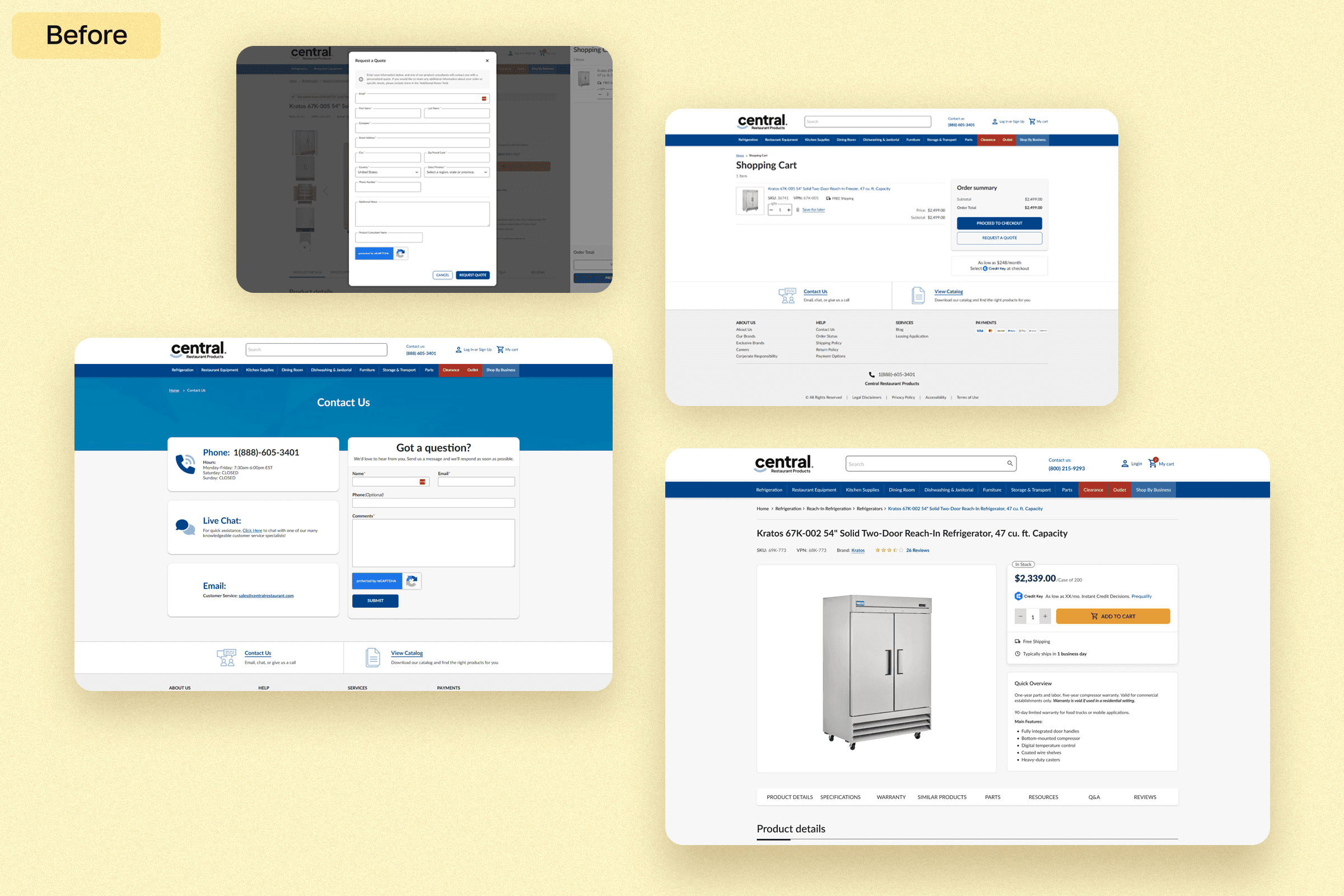
Results in the first month after launch, compared to the month prior:
The initiative delivered on both fronts: the website became a real source of quote volume, and the call center saw a measurable lift in revenue as a result.
Reflection
The constraint that shaped this project most was time. Three sprints meant validating with predictive attention modeling rather than moderated sessions with real buyers — a reasonable tradeoff for comparing design directions, but one that left real questions unanswered about how customers actually move through the new quote flow. With more runway, I'd have built real usability testing into the process: paper tests to sort through early concepts, and a moderated round with existing account holders on the high-fidelity prototype before handoff.