
MoveMint, Currency Exchange App
As part of the Google UX Certification coursework, students were asked to design a mobile app based on a prompt of their choosing. Up to this point, most of my UX experience had been in e-commerce, so for this case study, I chose a prompt that pushed me to explore a new space.
The development process was comprehensive: I handled every aspect—from research, concepting, and user testing to UI design, motion design, and brand development—leaning heavily on the design thinking framework to guide my work.
Prompt
Help global travelers find the current exchange rates between two currencies. They should be able to use this information to quickly and easily exchange currencies.
Solution
I designed an app that simplifies currency exchange by enabling travelers to track rates, research destination costs, acquire global currencies, and access funds using their preferred methods.
Year
2025
Role
UX/UI Designer
Digital Designer
Scope
User Research
Concept Development
Wireframing
Prototyping
Usability Testing
Motion & Interaction Design
Brand development
Digital Asset Creation
Animation
Research
Understanding the user
To find a viable solution, I first needed to understand the user. After outlining my goals, I began my research in the most logical place—speaking firsthand with the people that the product was intended for. I conducted a series of user interviews with eight participants focused on international travel, currency exchange, foreign financial systems, and purchasing habits. I supplemented these findings with secondary research and a competitive audit to assess the market landscape and understand how the users’ needs are currently being met.
Research Goals
Identify users’ current methods for checking exchange rates and exchanging currency
Uncover pain points within the currency exchange process
Explore frustrations and concerns related to unfamiliar financial systems and exchange rates
Understand preferences for exchanging currency and making purchases while abroad
User Quotes
“I travel internationally maybe once or twice a year, so every time feels like I’m relearning how currency exchange works.”
“I usually Google the exchange rate, but I never know if the number I’m seeing is what I’ll actually get when I go to exchange money.”
"I've used a few exchange apps, but all the graphs and data don't make a ton of sense to me. I'm just trying to get a rough idea of how much I'm spending."
“I mostly use ATMs abroad because it feels safer, but I don’t always know what fees I’m being charged until I check my statement later.”
Secondary Research

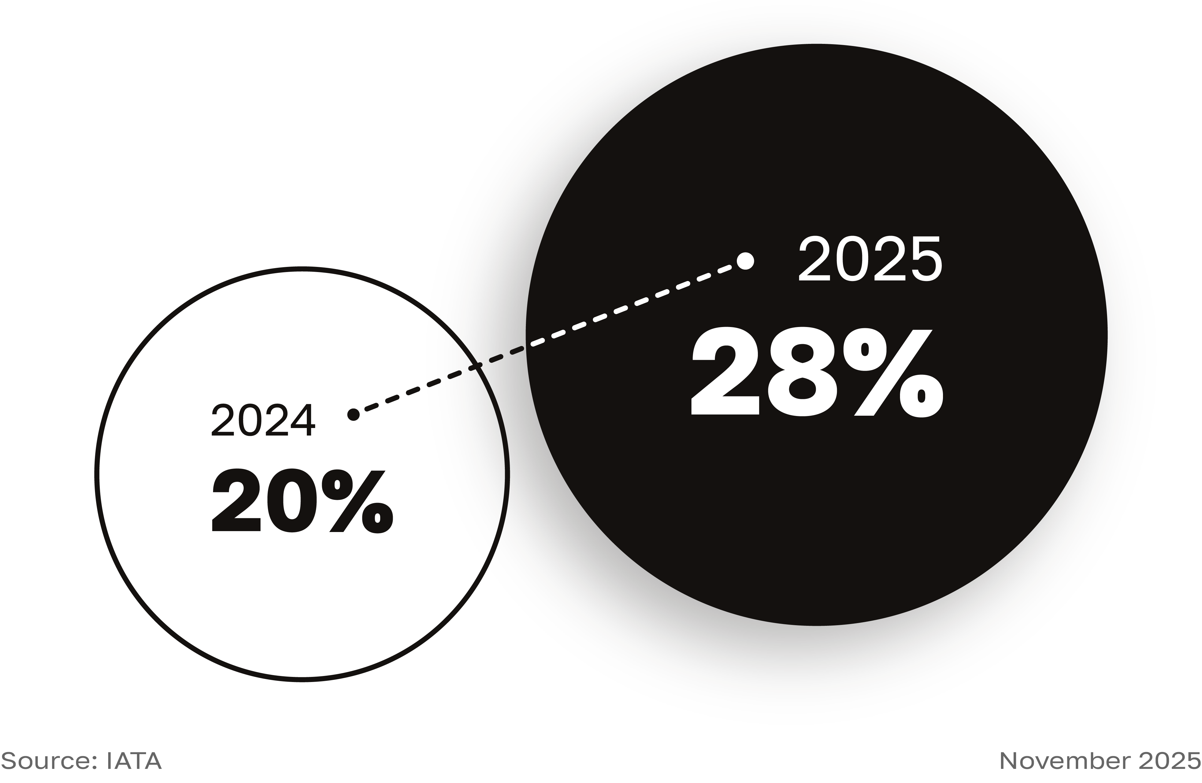


Competitive Audit
I evaluated four platforms across the fintech and travel space to understand how existing products support currency exchange, data presentation, financial management, and overall interface design. While there was some overlap in positioning and feature sets among direct competitors, the audit revealed several areas of unmet user needs.
Gaps
Opportunities
Synthesis
Turning insights into direction
With research conducted and data collected, it was time to pull my observations together into a clear narrative. I developed three distinct personas representing the goals, pain points, values, and habits of the target user base. To further humanize the experience, I created user journey maps that traced users’ steps—from preparation through returning home—and captured their emotional responses. These insights were then distilled into succinct, actionable user stories.
Meet the Users

Goals
Pain Points
Values
Habits
User Story
As a busy professional who frequently travels internationally, I want to exchange currency online and make payments digitally or by card so that I can feel secure and avoid unnecessary disruptions.

Paul is a freelance photographer who is only able to travel abroad every few years. Making the most out of his limited vacation time without breaking the bank are among his top priorities.
Paul is comfortable using technology but can be apprehensive to adopt tools that are complex and cumbersome. Above all else, he values simplicity and transparency.
Goals
Pain Points
Values
Habits
User Story
As a casual traveler who values their time, I want access to accurate information about currency exchange rates and locations, so that I can quickly obtain cash and avoid unnecessary costs while traveling.

Roberto spent over 40 years serving as an accountant for a large consumer goods firm. The demanding nature of his job left him with very little time to travel. Now that he is retired, he is planning to spend a few weeks traveling to several different countries on his bucket list.
Financial prudence is one of the many skills Roberto learnt from his career. Maintaining a strict budget and awareness of expected costs is of the utmost importance.
Goals
Pain Points
Values
Habits
User Story
As a budget-conscious traveler with multiple destinations, I want to efficiently manage various currencies, expenses, and costs, so that I can remain organized, structured, and confident during my travels.
Ideation
Exploring solutions
After clearly defining the problem, I explored potential solutions through a series of loosely structured brainstorming exercises, including multiple rounds of Crazy 8s and How Might We statements. To build on the personas and begin conceptualizing the user flow, I created both high-level and detailed storyboards. I then developed a more granular, action-oriented user flow and a series of paper wireframes to set the foundation of the interface design.
Storyboards
The high-level storyboard took a holistic view of the user’s experience, focusing on how the product could improve their travels, while the detailed storyboard articulated the potential form and functionality of the product itself.


User Flow
The user flow was intended to outline key actions, screens, and decisions while navigating the app, from account creation to exchange completion. The structure of the final product differs slightly from the user flow depicted below; however, this was a crucial step in visualizing user engagement, ensuring smooth navigation, and avoiding unexpected dead ends.

Paper Wireframes
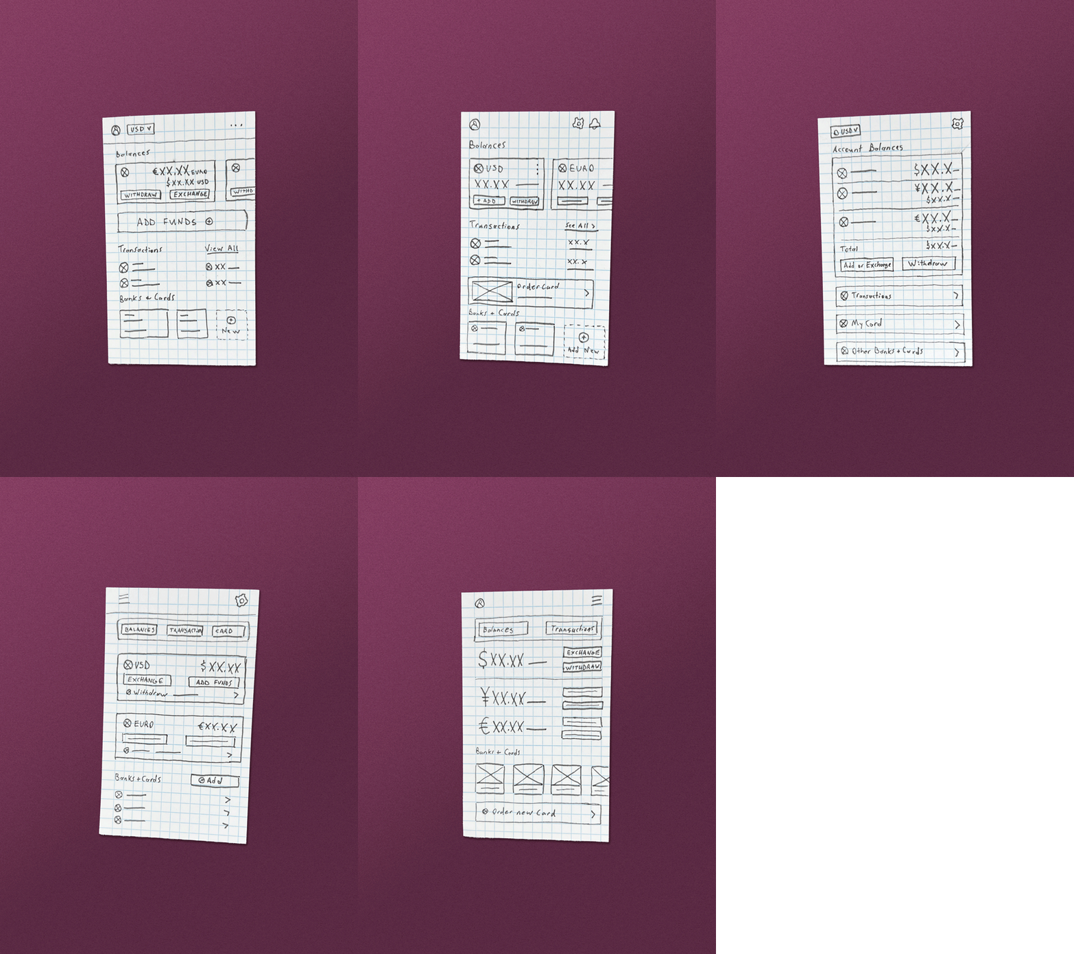
When exploring screens and UI, there were many possible directions to pursue. To generate ideas quickly and efficiently, I sketched over 30 paper wireframes on individual index cards. After creating at least five variations per screen, I reviewed the proposals and selected the most effective concepts to refine further.


Iteration
Building and validating solutions
In this phase, the structure and functionality of the app began to take shape. I translated earlier research and insights into low-fidelity wireframes and a rudimentary prototype in Figma. From there, I conducted moderated usability tests with individuals from the target demographic to evaluate the effectiveness of the designs and identify areas for improvement.
Lo-Fi Wireframes
I kept the low-fidelity wireframes intentionally simple. Their primary purpose was to ensure that all necessary screens supported users’ core objectives, including checking exchange rates and costs, exchanging currency, and managing funds. To reduce bias, I avoided overly refined design elements and instead focused on navigation, layout, and calls to action.

Lo-Fi Prototype
Usability Study
Over the course of three days, I conducted moderated, in-person usability studies with five participants. Sessions were fully moderated to better gauge users’ experiences through body language, open dialogue, and direct feedback. Participants were asked to complete five core tasks while I observed their click paths and ability to successfully complete each task.
Following the sessions, participants completed a System Usability Scale (SUS) questionnaire based on their experience using the prototype. The primary KPIs used to evaluate the design were SUS scores, time on task, and ease of completion—rated on a scale from 1 to 3, where 1 indicated seamless completion and 3 indicated inability to complete the task.
Affinity Map
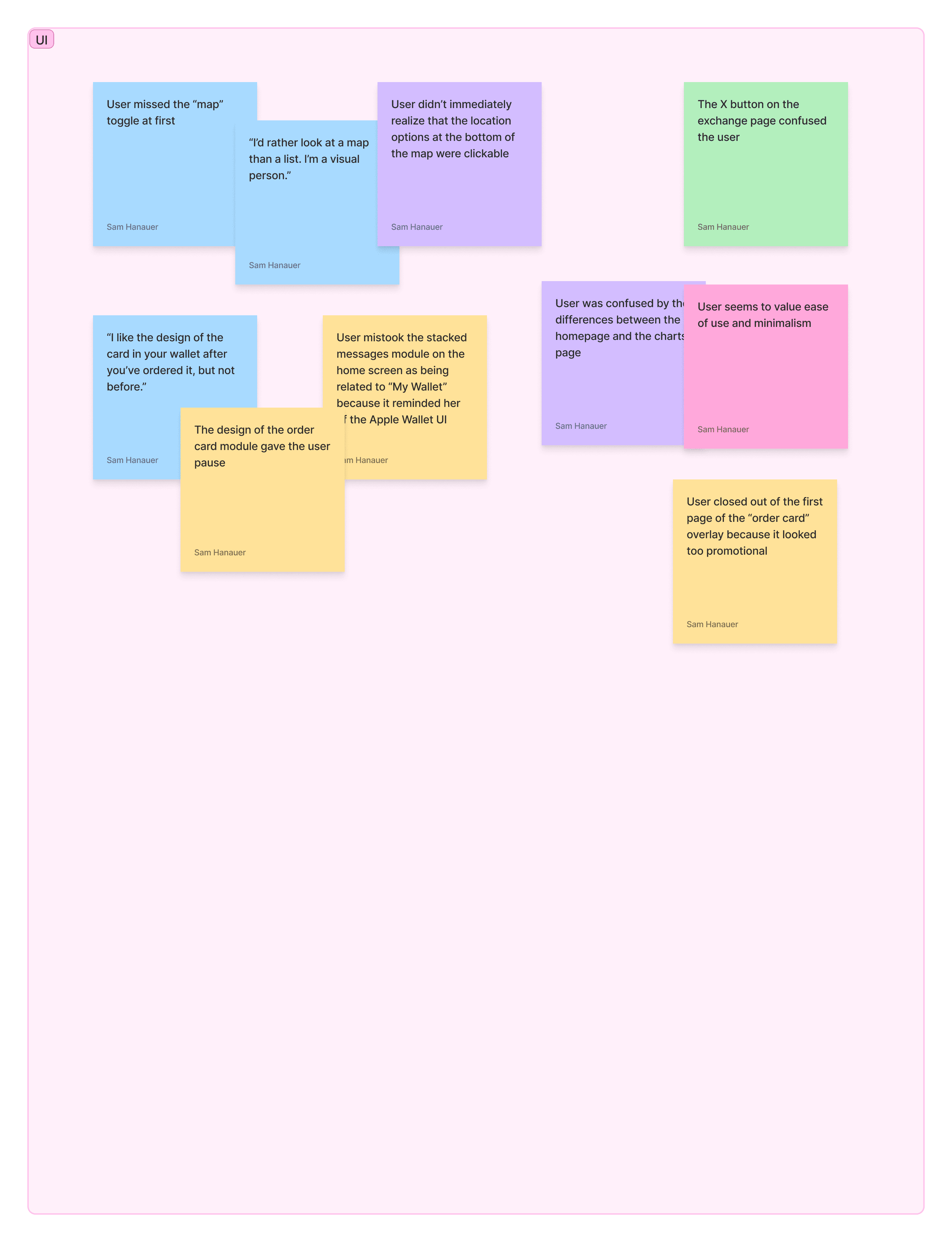
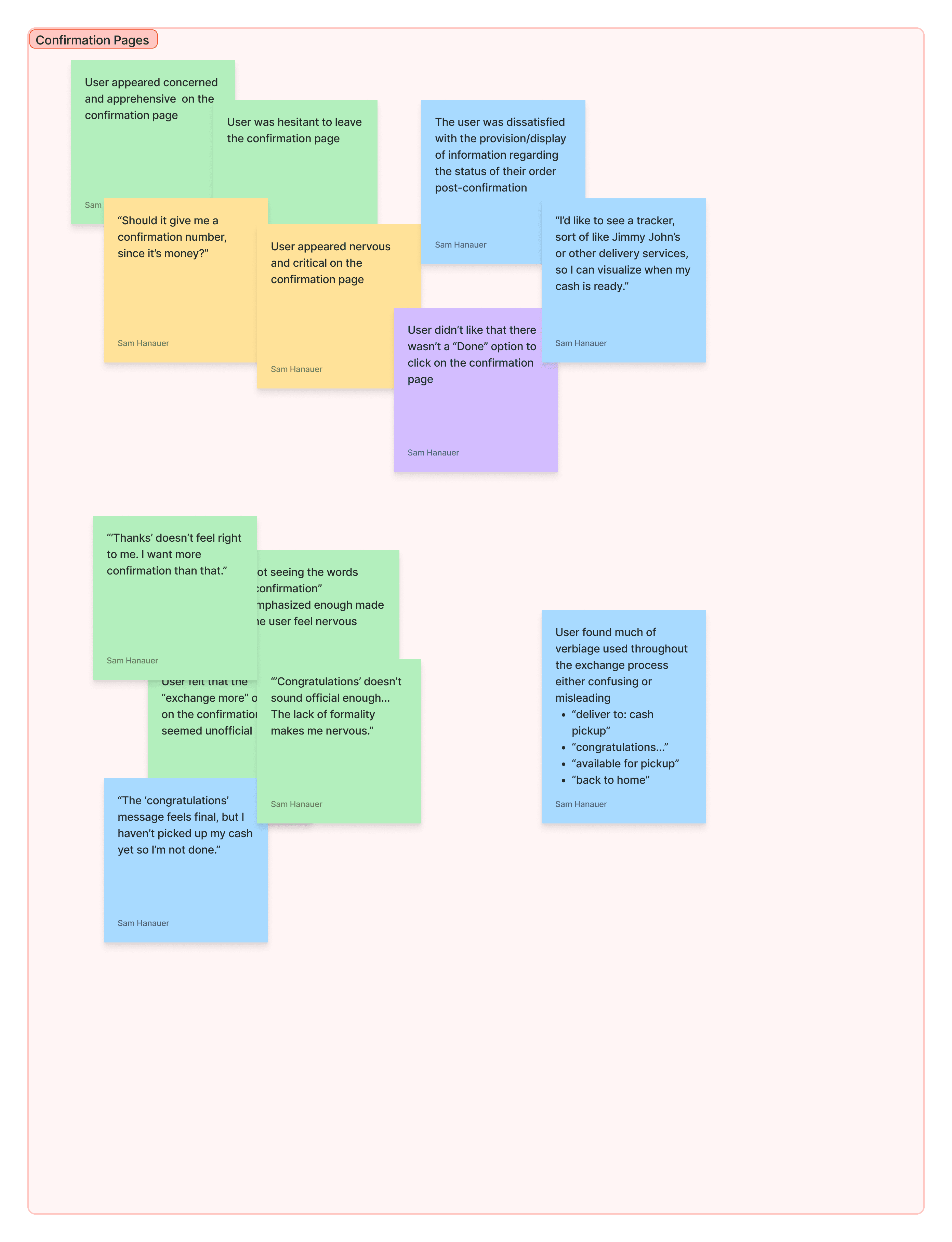
Using an affinity map, I organized my observations into distinct clusters to uncover key themes and patterns.




Insights
From the identified themes, I compiled a set of insights that were ranked by priority. Below are the insights designated as top priorities (P0 and P1). Ultimately, addressing these issues would remove obstacles to the product’s core functionality and improve the previously defined KPIs.
Users need clarity as to the status of their order through visuals and direct language.
Users need access to succinct onboarding steps to expose and familiarize the app’s offerings.
Calls to action and interactive elements need to be clearly labeled and accompanied by supporting copy to help users navigate with confidence.
Final Product
Introducing MoveMint
Drawing from the insights gathered during usability testing, I returned to Figma to refine my mockups and build a final prototype for MoveMint, the newly named app. Stepping into the role of brand designer, I developed a brand identity that included foundational elements—such as a logo system, color palette, typography, voice, and tone—along with supporting content, imagery, and animations. Additionally, I created a comprehensive component and pattern library to ensure consistency and efficiency across the UI.
1 / 7
Getting Started
After creating an account, the user moves through a series of onboarding steps that introduce the app’s core features. From there, users can proceed to the homepage or learn more about MoveMint’s card offering.
2 / 7
Homepage
The homepage highlights the app’s primary offerings and key user funnels while also providing access to account information, settings, and notifications.
3 / 7
Checking Rates
From here, users can monitor real-time rates, view conversion values, set alerts, and initiate currency exchanges. Additional navigation options provide access to supporting content.
4 / 7
Exchanging Currency
The exchange page allows users to adjust their order, select a payment method, and choose how they receive their currency—either directly to their MoveMint card or via cash pickup. From the confirmation screen, users can track order status and access directions to their selected pickup location, if applicable.
5 / 7
Exploring Costs
To help travelers understand the value of global currencies, users can search destinations and view detailed breakdowns of local costs. They can also personalize cost estimates by adjusting for budget, trip details, and other preferences.
6 / 7
Ordering a Card
By ordering a MoveMint card, users can instantly exchange currencies directly into their account. Available in both digital and physical formats, the card helps users avoid fees when making international purchases and withdrawing cash from foreign ATMs.
7 / 7
Managing Funds
Multiple currencies can be held and accessed within a single account. From the card page, users can manage balances and monitor transactions, helping consolidate travel expenses and available funds.
Takeaways
As a companion project to the Google UX Certification, this case study allowed me to put learning into action. Throughout the process, I leveraged disciplines I was already comfortable with—such as prototyping in Figma, concepting, visual design, and motion design—while also developing skills in areas where I had less experience.
The most valuable takeaway for me was gaining a deeper appreciation for structured problem definition. As designers, the eagerness to jump right into execution is almost instinctual; however, meaningful solutions require clearly defined problems. Leaning on a formalized process to synthesize research and data into actionable insights helped me stay focused, save time during ideation, and create a clearer roadmap for a successful product release.