Thin Glizzy, Pop-Up Restaurant Brand Identity
Opened in 2020 by local chef and salumist Chris Trevino, Thin Glizzy is an Indianapolis-based pop-up restaurant serving handmade footlong hotdogs. Since its inception, Thin Glizzy has quickly made a name for itself within the local food scene, hosting events with some of Indy’s most widely regarded restaurants, bars, breweries, and charities.
Chris first approached me to design a single event poster for what he assumed would be a one-time thing. However, after several successful events, it became clear that Thin Glizzy was here to stay. From that point on, I worked with Chris to build a brand identity that reflected his expressive, bold punk sensibilities and the ragtag spirit of the operation.
Year
2020
Role
Brand Designer
Illustrator
Scope
Creative Direction
Logo System
Color
Typography
Iconography
Illustration
Marketing Collateral
Merchandise
The Brand
Visual foundations
The identity needed a personality as loud and unapologetic as the people behind it. Finding the right balance was tricky. The edges had to be rough, but the vision needed to remain polished and accessible. Gritty visuals, a raspy voice, and a slightly irreverent tone became the foundation for the direction.
I drew inspiration from a wide range of visual references, including concert posters, comic books, late-’50s fast-food Americana, and vintage Korean advertisements.
Logo System
The name itself is a parody of the 1970s rock band Thin Lizzy, which provided a natural starting point for the style direction of the primary wordmark. I developed two monograms influenced by the Korean roots that define many of Thin Glizzy’s signature recipes. To round out the system, the brand needed its own mascot—reminiscent of nostalgic fast-food characters, but with an iconoclastic twist.

Typography
The expressiveness of the brand called for a typographic system that could be heard just as much as it could be read: bold headlines that trigger a double take, scratchy supporting text that adds contrast and character, and a functional base font that ensures clarity.

Color
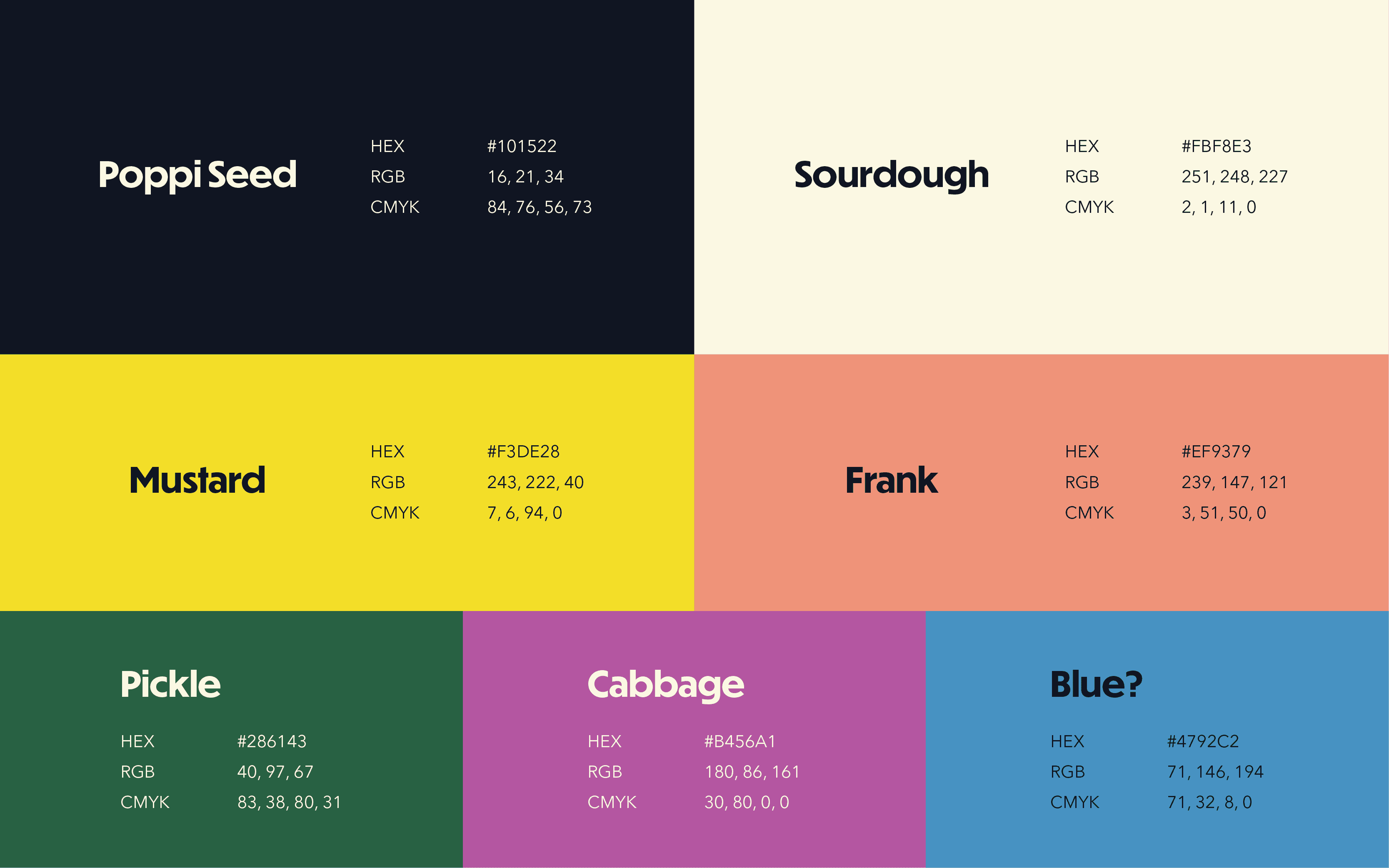
The brand’s palette needed to be high-impact and versatile, allowing for unique variations and combinations while maintaining a grounded consistency. A simple black and off-white served as the foundation for core brand elements, while a broad spectrum of supporting colors could be mixed and mingled to add freshness and fluidity.
Iconography
To further develop the brand’s illustrative style, I created a set of icons that felt exclamatory and loud, much like the comic panels that inspired them. Used throughout menus, packaging, and promotional materials, the icons bring ingredients to life and add visual context.

The Material
Marketing collateral
As a grassroots operation, spreading the word about Thin Glizzy and its upcoming events was essential. The messaging needed to be loud and in-your-face. As the business began to grow, so too did its marketing needs. To build hype and strengthen the brand, I created event posters, flyers, menus, packaging concepts, and more.
Event Posters
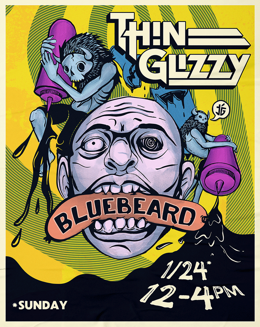
Drawing inspiration from punk rock concert posters, I illustrated and designed a poster for each event that could be distributed both physically and digitally.



Print Pieces
Thin Glizzy needed to make a lasting impression in ink. With a dedicated cult following, many customers even began taking the printed materials home as souvenirs.


The Merch
Branded goods and apparel
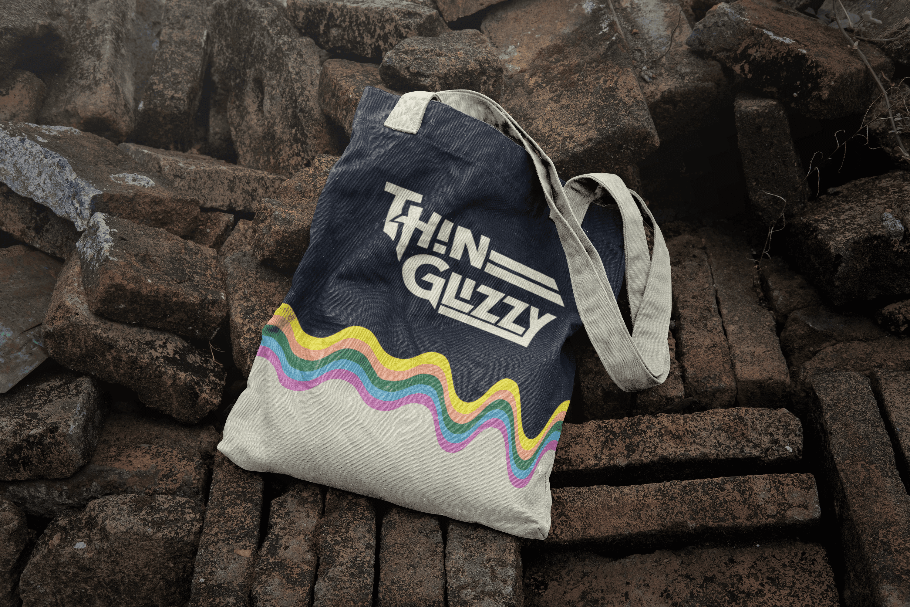
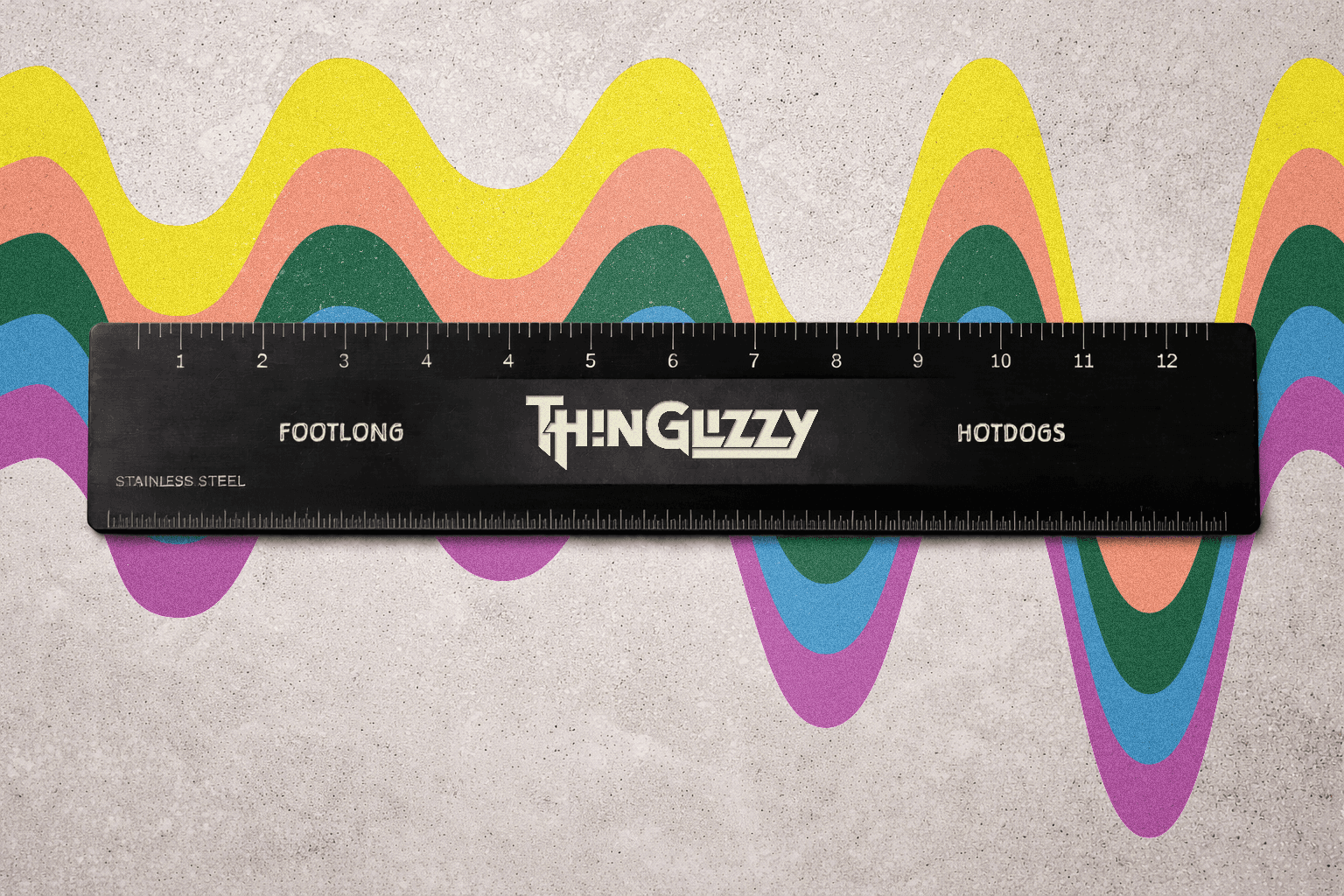
At many pop-up events, customers came for a hotdog and left with a T-shirt, a hat, or even a novelty ruler boasting the impressive size of the footlong. At one such event, a local screen printer was invited to live-print apparel and merchandise in real time, allowing customers to choose their favorite designs, colors, and materials.


The Future of Footlongs
As Chris continues to explore new culinary opportunities and passion projects, Thin Glizzy occasionally fades in and out of the Midwestern food scene. Even in its absence, the hype for the footlong hotdogs remains as strong as ever. With a recent relocation to Chicago, the next phase of Thin Glizzy’s lifecycle will see the brand taking on a city famously zealous about its hotdogs. Rest assured, there will be no ketchup on the menu.
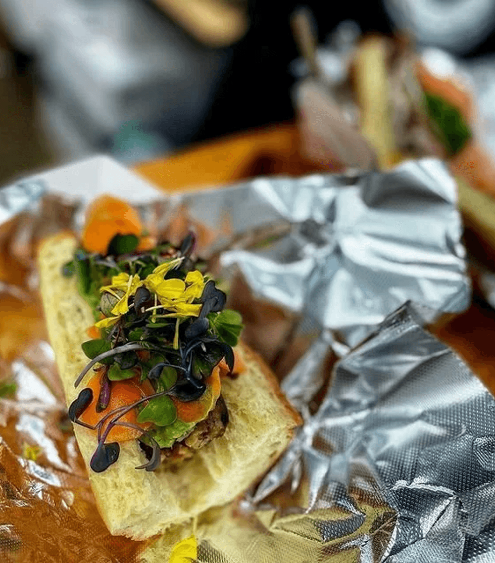
If you haven’t had enough yet, check out the photographs below for a small glimpse into the excitement that defined the brand.